We have grown, evolved, and made it easier for people to find, recognise, and support us — without ever losing the heart of who we are.
Easier to recognise – Easier to trust – Easier to help.
Stronger Mission. Clearer Identity.
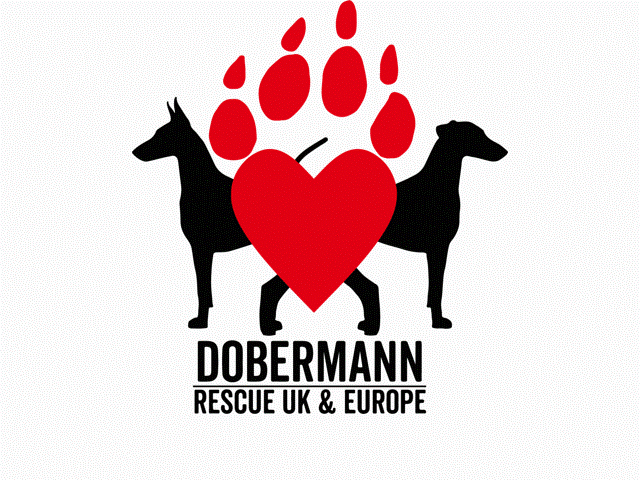
When we began, our logo was a bold symbol of love and protection — a heart formed from a claw, flanked by two proud Dobermanns. It represented fierce care, strength, and loyalty.
As we grew, so did our focus. The claw softened into a paw, and the heart became more open and bright — showing warmth, trust, and welcome.
But something else started to change. As the name “Dobermann Rescue” was getting more and more common, it became harder for people to know which group they were seeing. Even our name appeared in different forms across platforms: DRUE, D.R.U.E, D.RU.E, and sometimes the full charity registered name.
People weren’t always sure if they were looking at us — and that made things harder for the dogs who rely on us. So we have made things simpler. One name. One look. One clear identity.
More clarity Same compassion Greater impact
A logo that tells a bigger story
Every part of our new look reflects how far we’ve come — and where we are going:
- The claw became a paw, showing care instead of defence
- The heart became open, soft, and spacious — making room for more dogs in need
- And the name DRUE is now fully part of the symbol — clear, bold, and unmistakably us
It is not just about looking different. It is about standing tall as one strong, united family — ready to welcome, protect, and love every Dobermann that needs us.